

Geometric Typography design
I took heavy inspiration from geometric typefaces by designer Sui Ki Law. Her geometric typography uses bright colours which border on abstract.
Using this work as a source, I designed this font for a brief. 'create a font using only shapes within an hour'. This was done to test both our skills within adobe illustrator and our work rate.
I felt this mainly successful although if i had had more time, i would have liked to increase the level of abstraction with some of the letters.


Custom Font
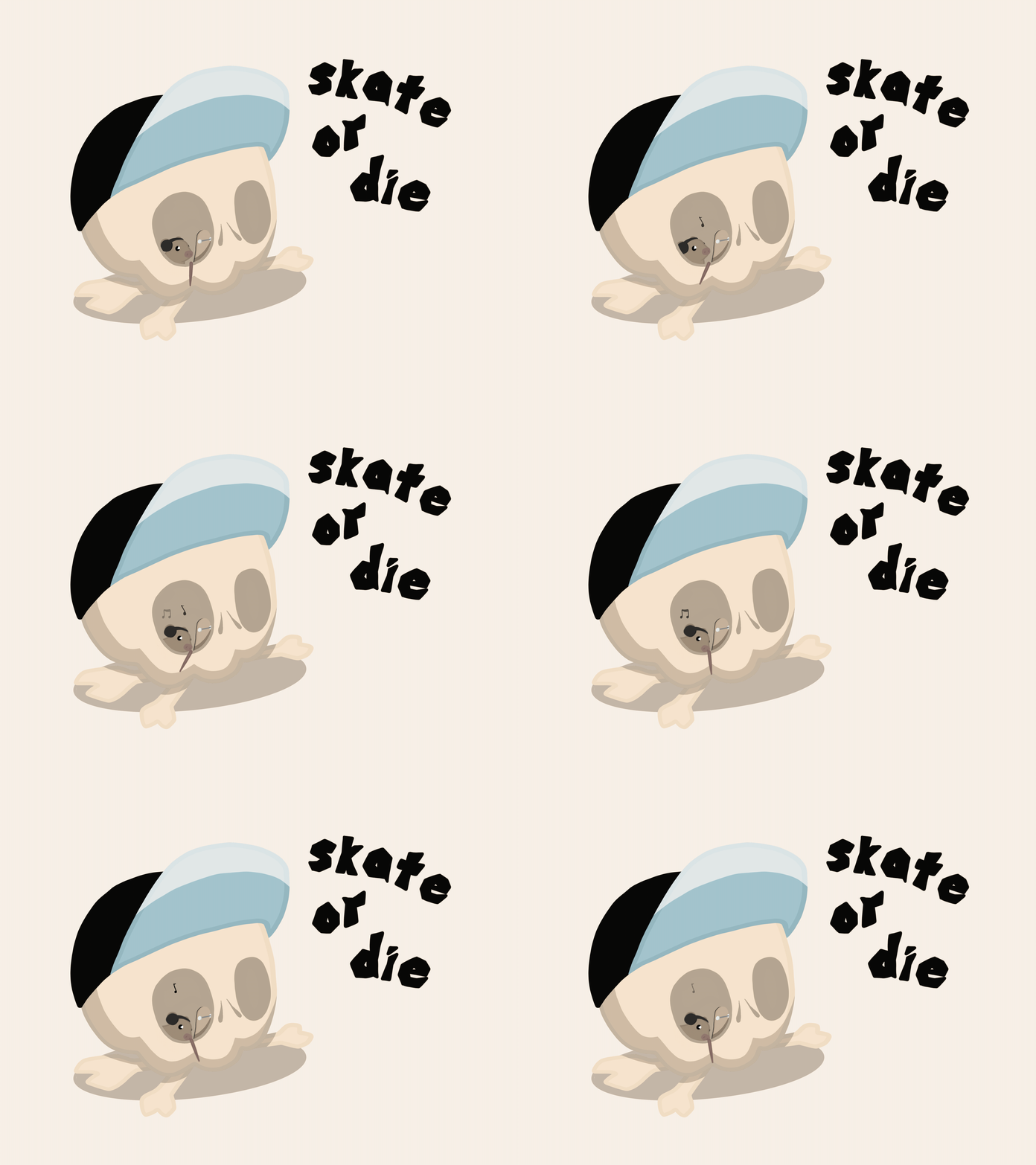
My Font is inspired by the style of Jamie Christopher Hewlett, a English comic book creator, illustrator, music video director, and songwriter, who was a student inWorthing, West Sussex studying art. His style has very jagged edges and often uses some sort of animal in his drawings.these animals are usually shown doing some form of human activity. like a walking on two feet, wearing clothes.He uses a variety of colours but mostly brighter colours and usually is centred around one colour.


Using fonts in Packaging


This tote bag design was made for my first research project that i received at college. The brief was to create a logo design centred around a specific font. I was given helvetica.

When i did my research looked i looked into bold graphic styles found in greek art and architecture. These pots gave me inspiration to develop a circle design initially in illustrator which translated into the circle design for the bag.
In the use of this circular design i was looking to create a sense of dynamism whilst still using a simple font. The power of a 'classical' design i tried to emphasise in my choice of the text used in the circle 'being abstract is boring, let's keep it simple'. The dependability of the classical and this particular font seem seemed could be emphasised with addition of the subtitle "the Swiss one". This also pays homage to the fonts original name so that the design gave a sense of the fonts history. I was trying to make the most common font in the world more visually interesting without detracting from its strength.
Impact in Page Layout


The brief of this project was to explore how text can make an impact on page layout.
As i was given the impact font i wanted to explore the way the font has been used over time and what it is best suited for in page layout and digital media.
I looked, initially, at sources from communist era R propaganda. Specifically during the era of the space race. Blending 2 'super powers' through the addition of the American space shuttle '26 Julie'. I used the Russian translation of the impact font to cement the culture into the design.
I went onto mock up a social media page using the impact font , this time using it in all capitals. I then mocked up a news paper spread. The gave me the opportunity to further explore page layout, which although done in illustrator, led me to consider in greater detail, different alternatives for page design, such as 'adobe indesign'.


I went onto mock up a social media page using the impact font , this time using it in all capitals. I then mocked up a news paper spread. The gave me the opportunity to further explore page layout, which although done in illustrator, led me to consider in greater detail, different alternatives for page design, such as 'adobe indesign'.


