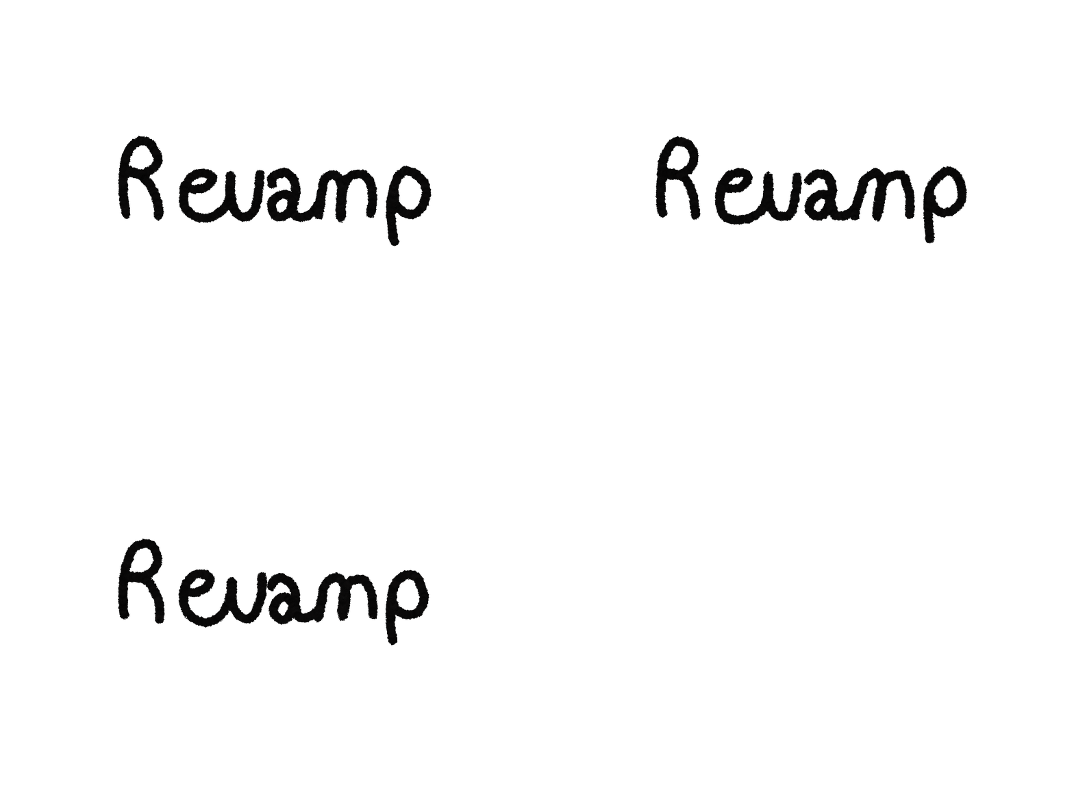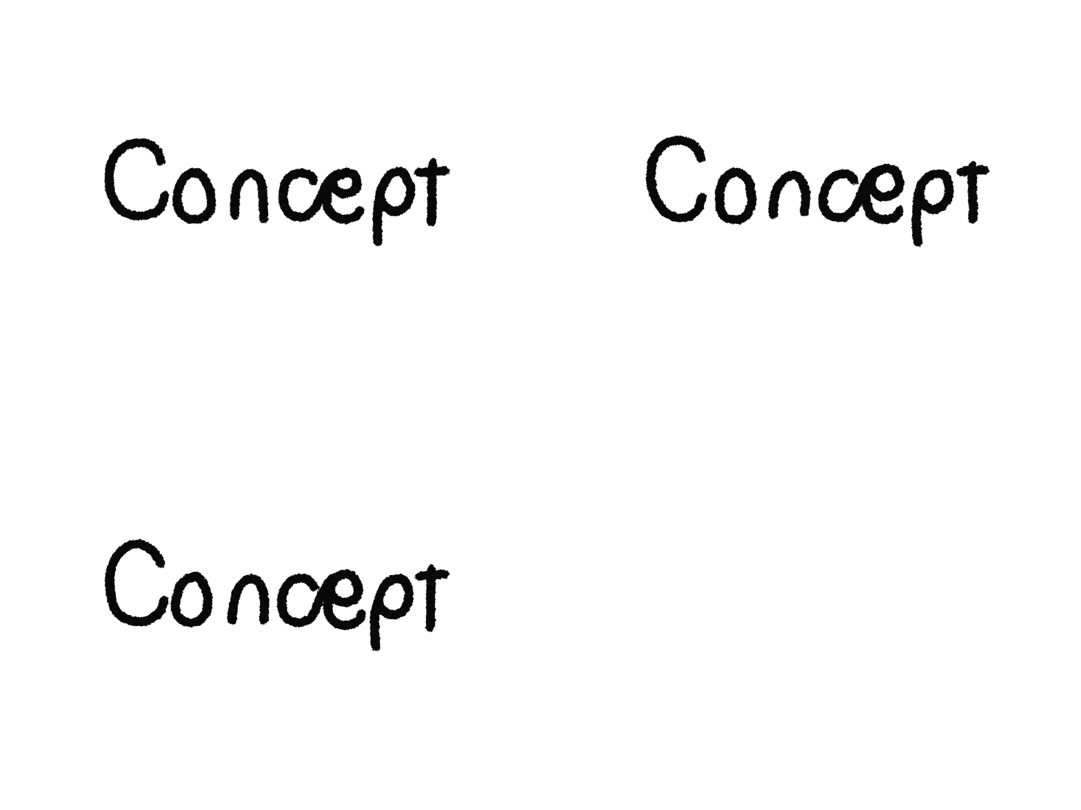


This font was made for my first project of year two, the project was to create a new 'counter culture'. The font itself was molded off the metal piping of common brutalist buildings seen around Birmingham. The font would be used for a new counter culture magazine that i was making.
The main target audience for this magazine would be impressionable teens around the ages of twelve to seventeen so they would be more willing to give this new 'counter culture' a try. So to appeal to them, the font was made very explosive and geometric, taking the old research of miss Sui Ki into consideration.

This font was made for my first project of year two, the project was to create a new 'counter culture'. The font itself was molded off the metal piping of common brutalist buildings seen around Birmingham. The font would be used for a new counter culture magazine that i was making.
Concept Revamp Final Font Design
Concept Revamp Final Magazine Design


This magazine serves as the centrepiece of the counter culture project, designed to promote its purpose. Combating modern society's wastefulness and narrow views on attractiveness. It highlights the positive impact on the ecosystem that reusing has and encourages creativity before discarding items. Additionally, it showcases artists aligned with this culture, including Steven Colgan's metallic instruments made from trash, Marcel Duchamp's 'ready-made art,' and Banksy's conceptual pieces.

This magazine serves as the centrepiece of the counter culture project, designed to promote its purpose. Combating modern society's wastefulness and narrow views on attractiveness. It highlights the positive impact on the ecosystem that reusing has and encourages creativity before discarding items. Additionally, it showcases artists aligned with this culture, including Steven Colgan's metallic instruments made from trash, Marcel Duchamp's 'ready-made art,' and Banksy's conceptual pieces.
The magazine's design deviated from its theme, drawing inspiration from Ryan DiGiorgi, creative director at 'Jackbox Games,' particularly his claymation style. I believe the vibrant colours and style appeal to a younger audience, who can drive positive change better through this 'counter culture'.


Concept Revamp Branding Sheet


The brand presented below was developed for the first brief of my second year in the course. The task was to create a new 'counter culture' and transform that concept into a brand. This challenge of redef something traditionally anti-establishment into an establishment was quite confusing and often left me stuck due to conflicting ideas. However, I eventually arrived at a concept centered around waste, junk, and recyclables. The aim was to take items that people usually perceive as unattractive or unworthy and repurpose them into products that consumers genuinely want to buy.


I am using the story of Hecatoncheires to create a logo. The story entails the son Uranus and Gaia. Who was seen as so ugly that he was cast away into the depths (much like trash). When he was released, he became a skilled blacksmith and was finally seen as useful. Although this is a similar to the other logos origins, It is much less pleasant.


